This guide will explore how to share state between components using React’s Context API.

Posted By
Jett Turner
This guide assumes some basic React and TypeScript knowledge. I won't be explaining any of the styles, but you can copy the component at the end of the article to view how it’s made.
Framer offers a wide range of features that enable you to create virtually any design you envision. If Framer doesn't directly expose a particular feature, you can easily create a simple code override to implement custom styles or animations for your design. The complexity increases, however, when you need to share state between components.
Regular components allow you to track basic states with a linear flow, expressible through component variants. This works well for components with boolean states like toggles or drop-downs. However, when sharing state between components, custom code may be necessary. Fortunately, Framer simplifies this process through its integration with React.
State Management Options
Framer offers its own state management solution, the createStore function. This function allows you to create a shared store, usable in multiple components and overrides via the returned useStore hook. This approach is ideal for a single piece of state that needs global sharing. However, it may cause issues if you need to reuse the component multiple times.
The Problem
Imagine you need a multi-step form component in Framer and want to use a page for multiple questions. With global state management, such as Framer's createStore, all instances of your form would share the same state. This would cause values set on one page to appear on another. One solution would be to clear the state when the page is submitted, but sharing a single piece of state for multiple locations of data is not ideal.
The Solution
In React, one effective way to create isolated pieces of shared state is through the Context API. This approach requires slightly more setup but makes the component’s state much more maintainable. Context works by wrapping child components with a provider that allows access to some state on the parent component. By doing this, each copy of the root component will have a new piece of state independent of each other.
Practical Implementation
To show you how this is done in Framer, I will walk through a page of the multi-step form previously mentioned. For each page, a separate piece of state is required for the user’s choice.
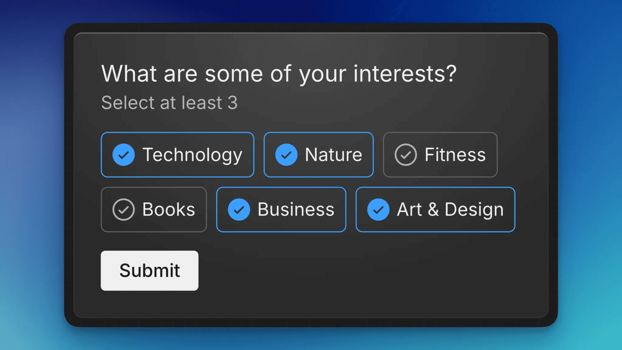
For this example, I will create a single form page that will require the user to select a set amount of interests. Once the user selects that amount, the submit button will become enabled, allowing the user to move to the next page.
What We’ll Go Through
How to implement shared state management between Framer components using React's Context API
Step-by-step implementation of:
A Context Provider for managing form state
Interactive form components that share state
Form validation based on shared state
Creating the Context Provider
The state of the page will be stored on a root card component. The two places that will need to interact with the state will be the form options and the submit button. We will first start by creating the state along with the provider in a component override.
In the above code, we start by creating InterestsContext with an initial value of null. This will be what provides the state values to the child components. We also create a helper useInterestsContext hook to make it easier to access these values later. Inside of the component override we use the useState hook to store an empty array which will hold the selected interests.
The above code shows what the override returns. There is a lot going on so I will break down whats happening. On the first line after the return keyword is the InterestsContext.Provider component. This component wraps the component that is being overridden. Within the value property I am exposing some values and methods that the child components can use to interact with the state:
interestsis a value that holds the list of interests that the user has selected.addInterestsis a method that takes an interest value and appends it to the array, creating a new array with the previous values to make the state trigger an update.removeInterestsis a method that takes an interest value and filters it out of the list, again creating a new array with the spread operatorcheckSelectedis a method that takes an interest value and returns a boolean value which can be used to check if an item has been selected. This will be useful on the interest items to switch between variant when one has been added to the list.selectAmountis a value that will allow for the submit button to check whether or not the right amount of interests have been selected.props.selectAmounthasn’t been created yet so we will do that next.
To enhance type safety, you can define these as a type for the Context we previously created.
Creating the Root Component
Back in the design editor, create a card component with a title and apply the override that we just created. Make sure that this is applied to the component instance, not the inner element since we need to intercept the selectAmount prop.

Below the title, create a subheading component to display the required number of interests. The number should be a separate element with its content value set by a variable.
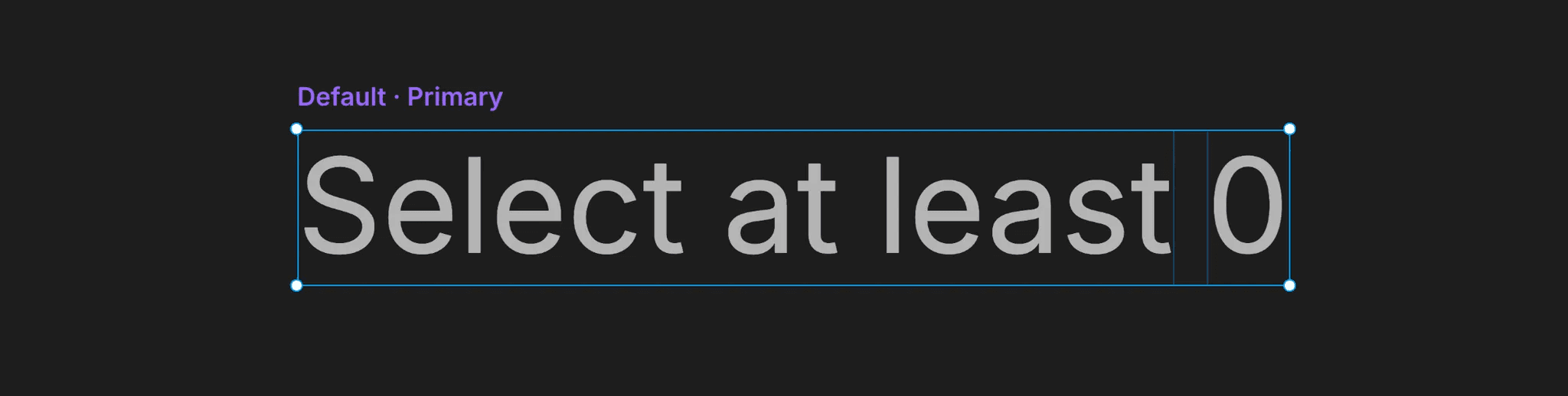
In the parent card component, create another variable for the amount, but make sure that this matches the prop name in the override. In this case, the name will be Select Amount. This will be converted into the camel case selectAmount prop in the override. Link this to the subheading component variable that we just created.
Using the Context Provider to Set a Variant
Next, create a component for the interest options. Create two variants for Checked and Unchecked. Add a variable called Title and link it to the text content. Instead of connecting these variants through the interaction menu, we'll use an override. This approach allows us to set the active variant based on whether the interest is in the list of selected items.

Back in the override file that we created earlier, we will create a new override for this component.
The interest variable aliases the title variable we created earlier. This is optional but makes the code more readable. Next, we access the Context Provider and assign it to the context variable, which contains all the values and methods we passed to the value prop earlier in the Context Provider. We then create an isChecked variable using the checkSelected method to determine if the provided interest value is in the list. Make sure to include the optional chaining operator otherwise the component may disappear in the editor.
The handleUpdate function will be called whenever the interest option is clicked. If the list contains the interest value already, it will be removed. Otherwise, it will be appended to the list.
The returned component incorporates two key modifications. Firstly, we assign the handleUpdate function to the onClick event. Secondly, we determine the active variant based on the component's checked status.
Now, below the subheading, create a list of different interests and apply the override that we just created to all of them. You should now be able to go into preview mode and select the different options.

Make sure that you are not inside of the component when previewing since the context is only available on the outside.
Adding Validation
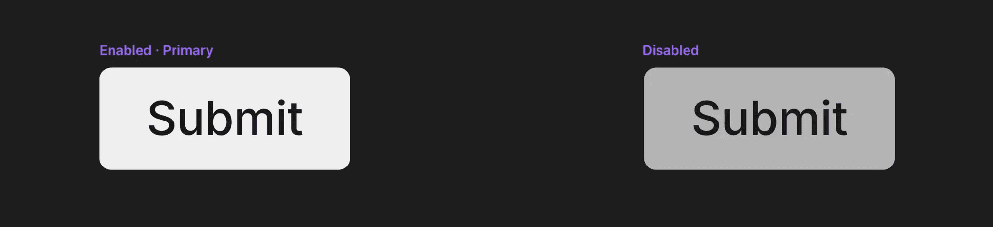
The last element that we need to create is the submit button. This button will have two variants, Enabled and Disabled. Once again, we will link these inside of an override rather than through the interaction menu.
Moving back to the overrides file, we will create one last override.
This one is a much more simple. It retrieves the context using the useInterstsContext hook, compares the length of the interests lists to see if its less than the select amount and stores it in the disabled variable. Using this variable, the variant property is conditionally set in the returned component.
Apply this override to the submit button and set the Select Amount variable on the root component. Run the preview and you should now have a working component.
Considering Improvements
This example can be further improved in several ways. While it's currently set up for an interests page, you could adapt it to collect various types of information, such as personal preferences or users' skills, enhancing the component's reusability.
Additionally, using proper HTML form elements would improve accessibility. The Form Builder is the primary option for creating forms in the visual editor. While it's suitable for simple forms, syncing the Form Builder’s checkbox state with our custom state would be challenging.
An alternative approach would be to create custom components for form-related elements. However, importing shared state into separate files can lead to maintenance issues. Due to Framer's import mechanics, the file containing the context instance would need to import itself to match the imports of other files, as they would otherwise reference a different context instance. Moreover, any updates to the file imported by other components would require updating all import links, adding to the complexity.
Given these challenges, it's generally advisable to avoid creating such intricate components unless absolutely necessary. Fortunately, numerous third-party plugins are available that simplify form creation, though they offer varying degrees of customization.
Wrapping Up
As you continue to explore Framer's capabilities, remember that the balance between complexity and functionality is key. While it's possible to create highly sophisticated components, always consider whether a simpler solution or a third-party plugin might be more appropriate for your specific needs. The goal is to create efficient, maintainable, and user-friendly designs that effectively communicate your ideas and enhance the overall user experience.
By mastering techniques like the one demonstrated in this article, you'll be well-equipped to tackle more challenging design problems and create truly interactive and engaging solutions in Framer.
To view the finished component, you can copy it here.